Responsive, Mobile-Friendly Website Design
Our websites are thoughtfully designed for smartphones and tablets.Consideration of how a website looks on mobile is necessary nowadays since over half of all Web traffic is through smartphones. Websites built with a “responsive” layout adapt to any screen resolution, so they look beautiful no matter what they’re viewed on. Without these mobile-friendly websites, mobile visitors quickly lose interest in the hard-to-read desktop version of the site and leave. Prevent this by letting us optimize your website to tailor to your future website’s customers!


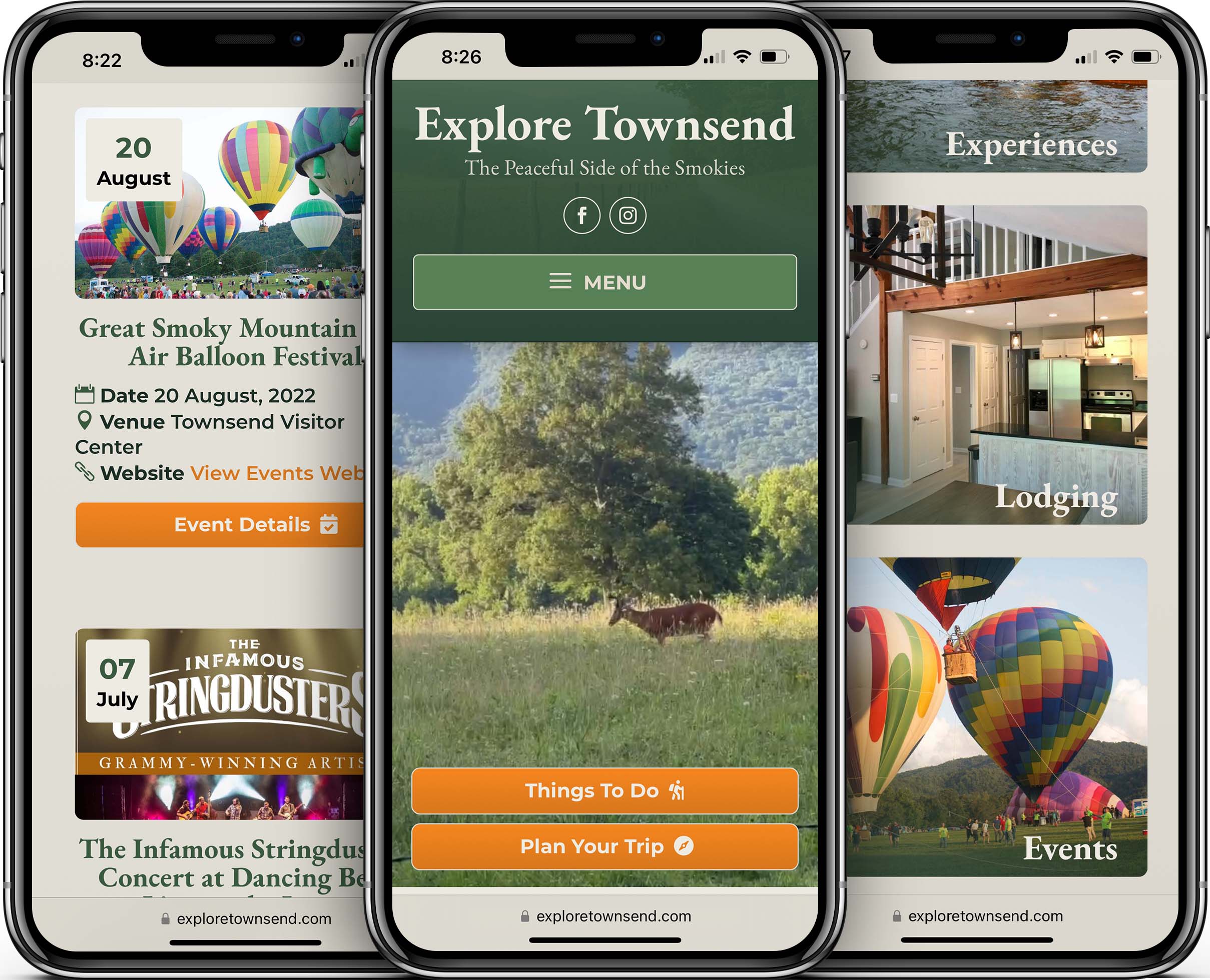
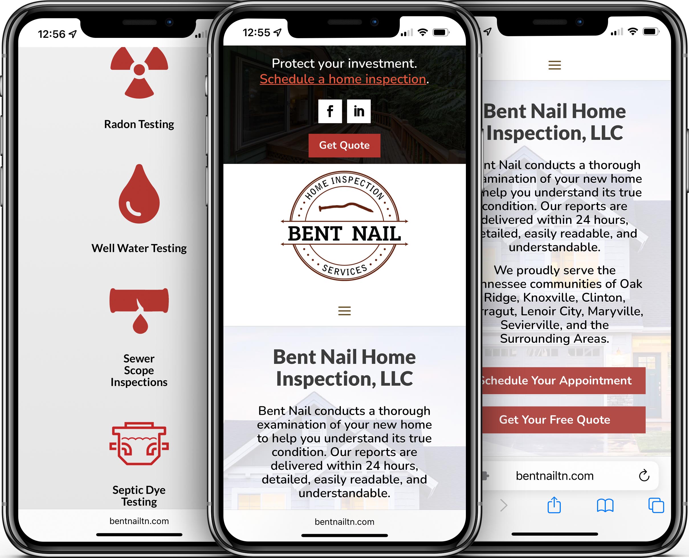
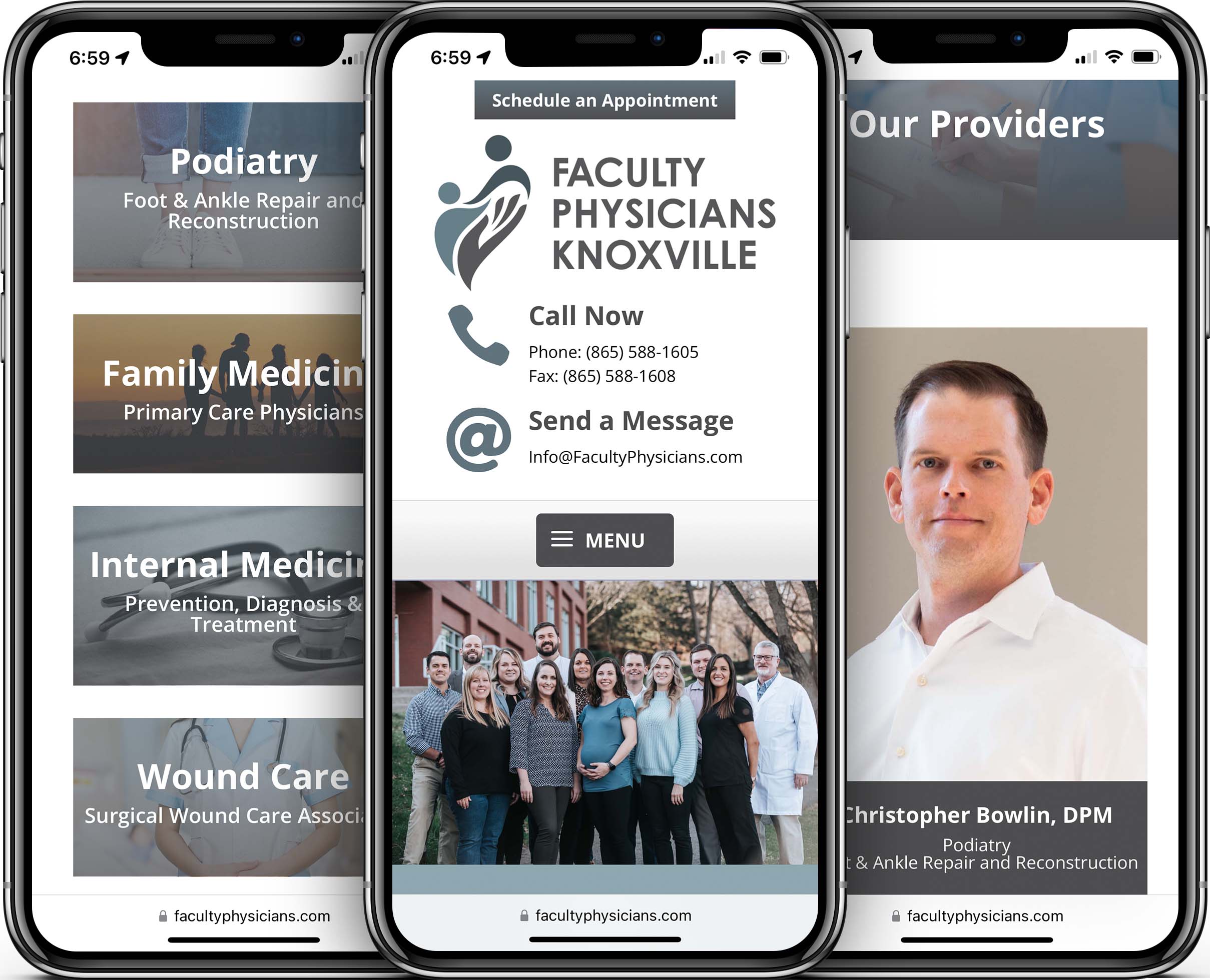
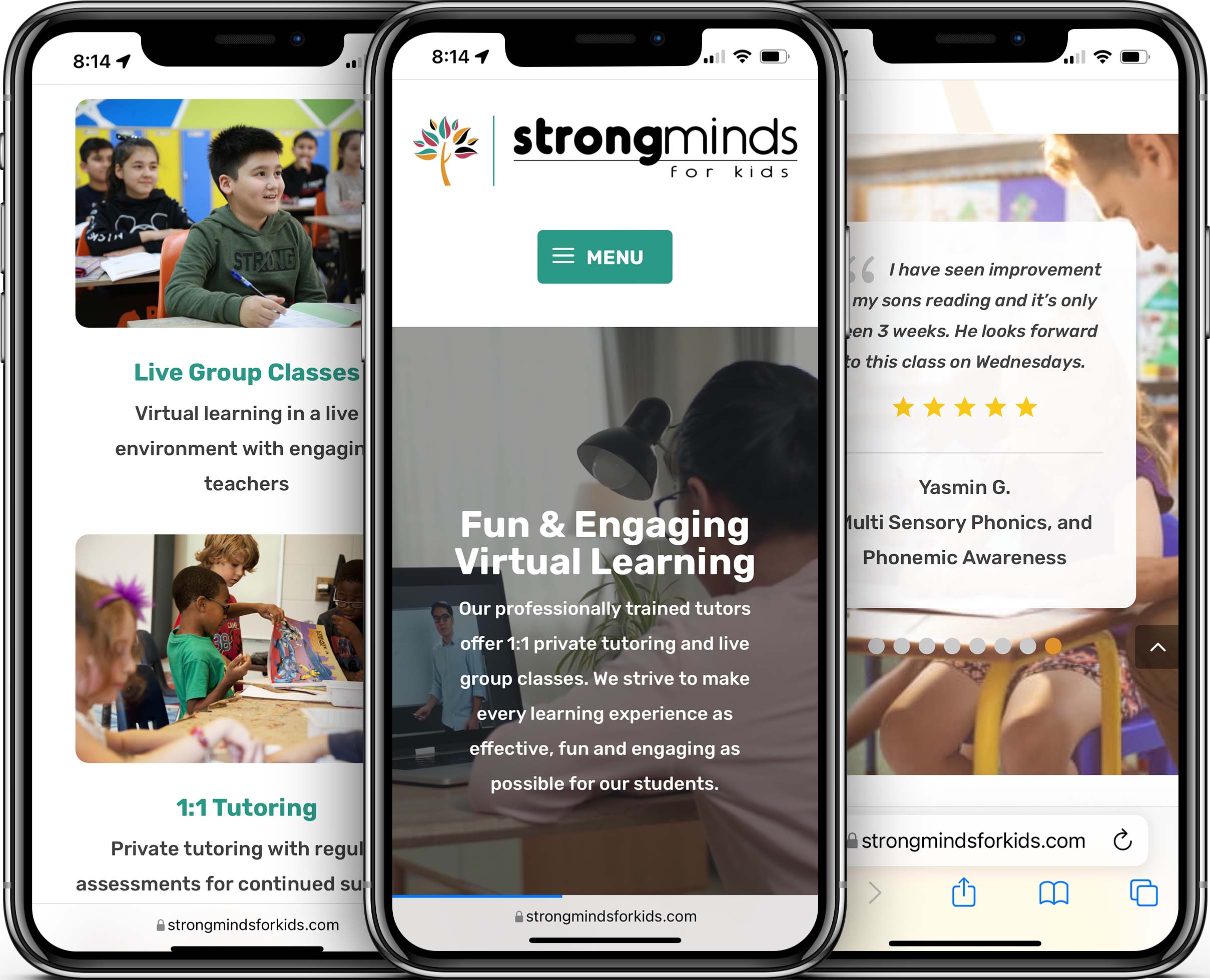
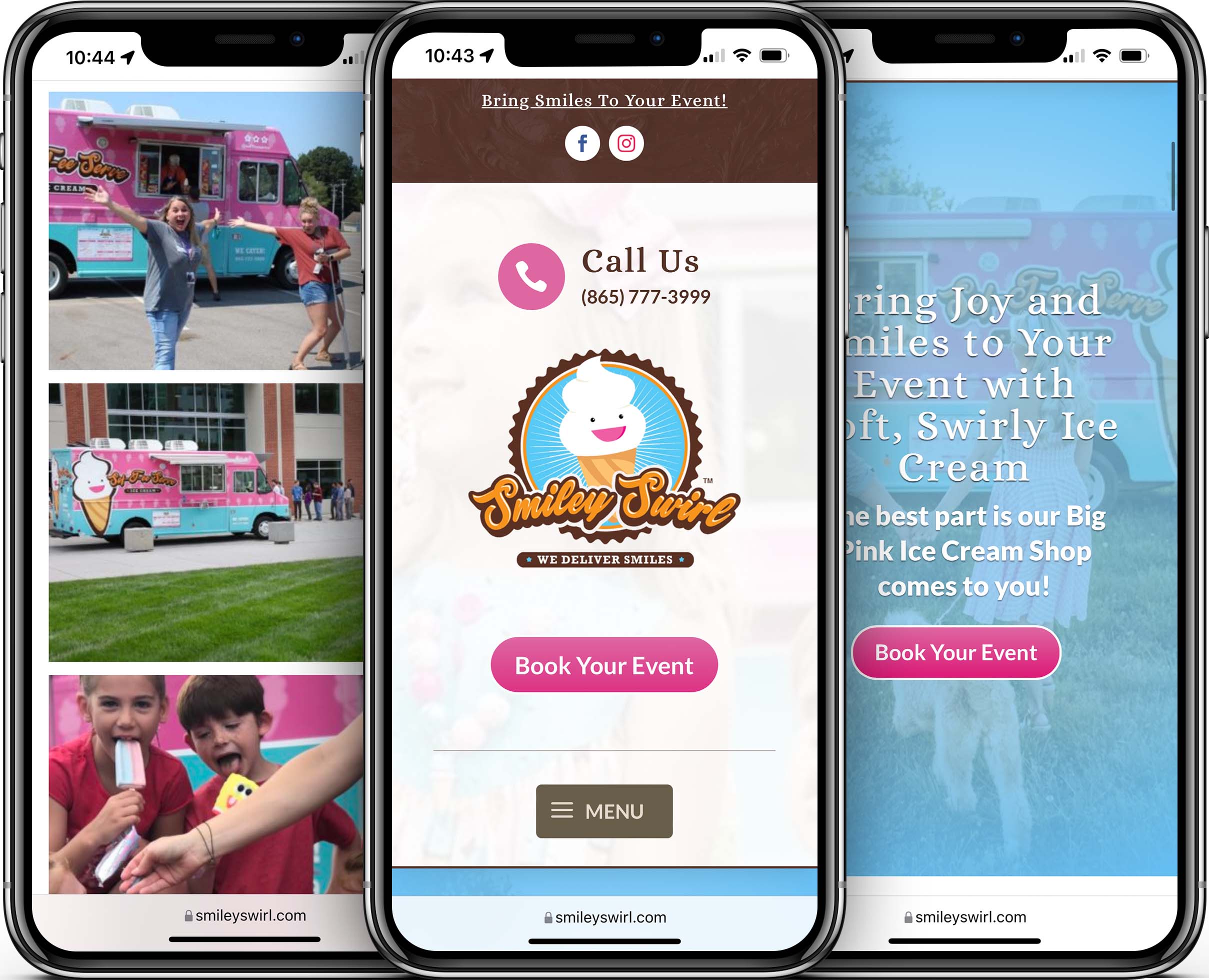
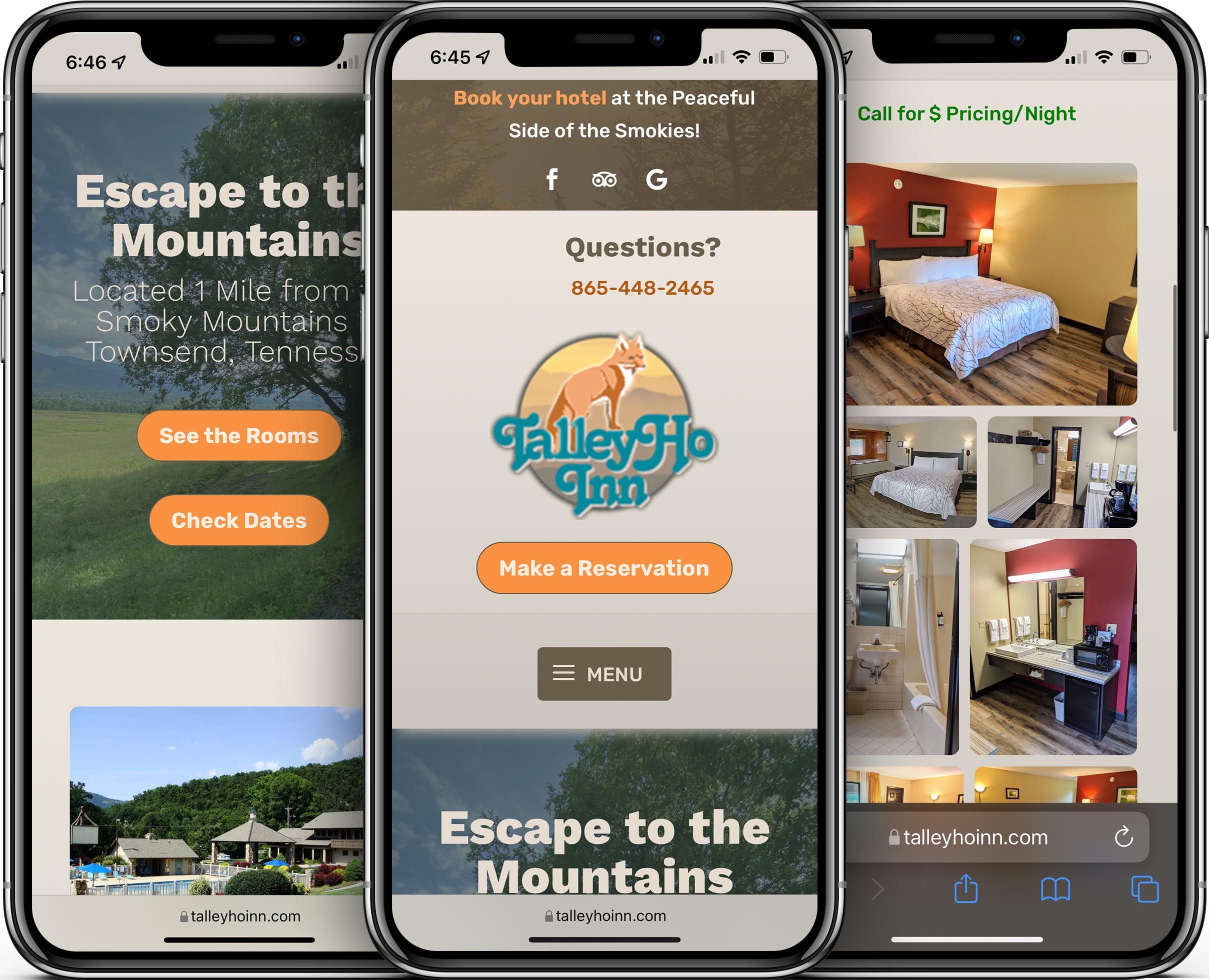
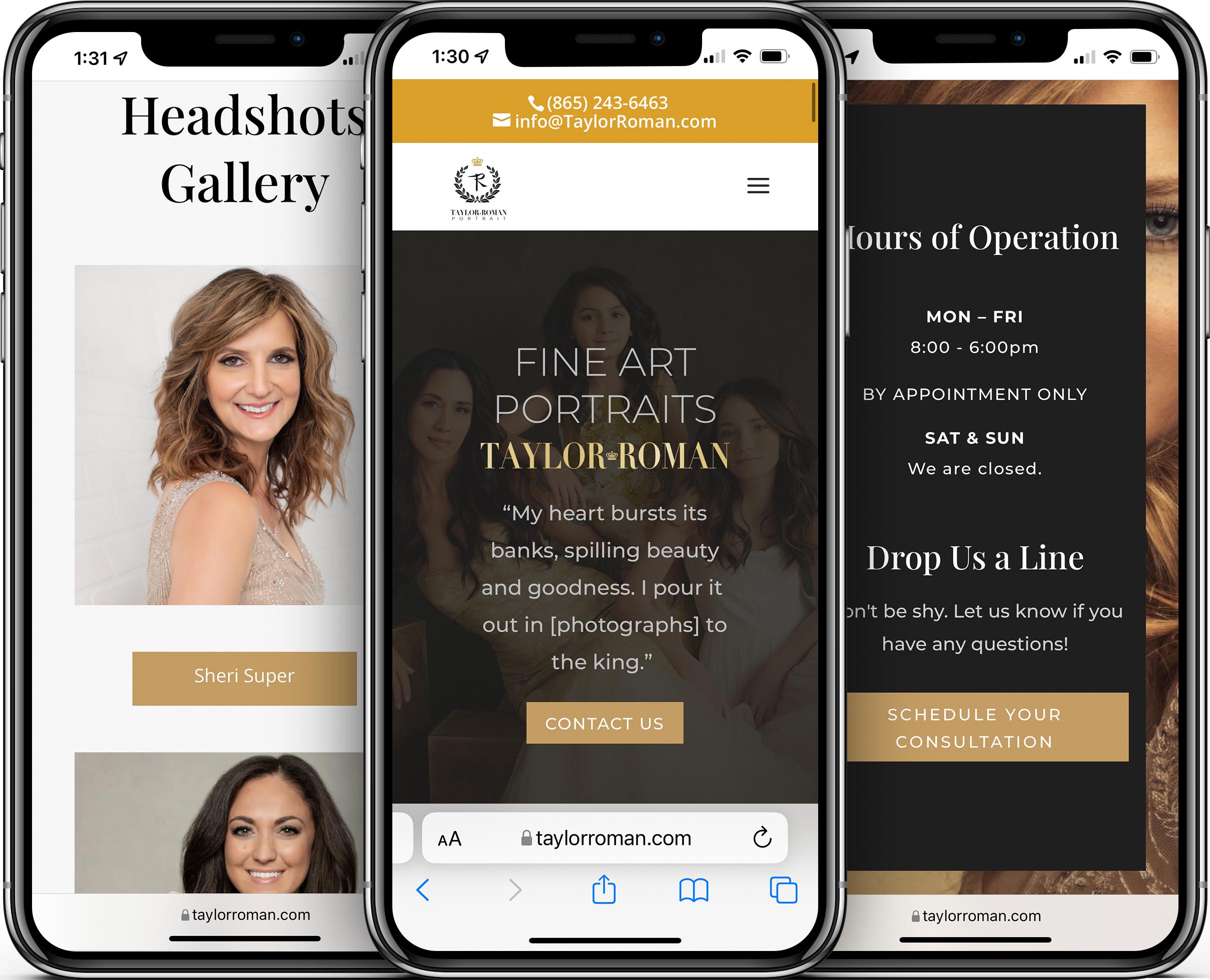
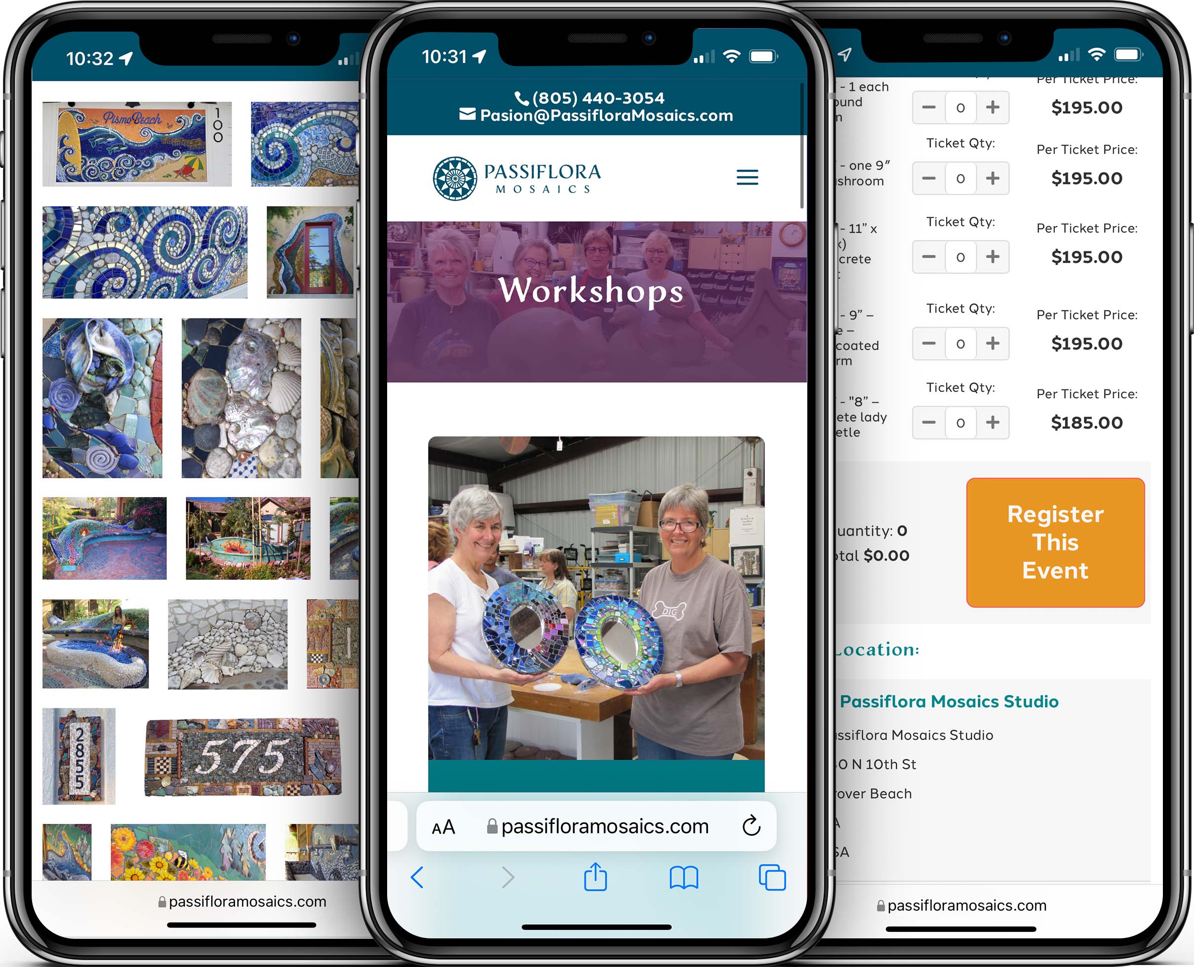
Samples From Our Portfolio
Here are some websites we have designed to be mobile-friendly.
Click to enlarge screenshot.


✓ Our Mobile Design Services Earned Us a 5-Star Google Rating!
Leighton at Pioneer Media transformed our outdated website, giving it a more modern and user-friendly design. He was easy to work with and made the entire process very simple on our end. He listened to what we wanted and made sure we were 100% satisfied with his execution of our ideas. We couldn’t be happier with our new (and improved) site and would highly recommend Leighton and Pioneer Media for those looking to update and/or maintain their websites! Read the signed testimonial here.
Again I’m just blown away by the awesome job That Leighton with Pioneer Media has done for my business!
I can’t even believe that the price was so realistic… I know he could get a lot more for the job he does! Thank you Pioneer Media … Paullette”